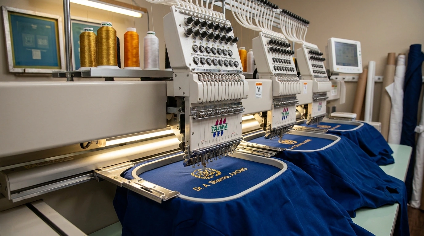
Most uniforms use a left chest logo, and for good reason. It is visible in conversation, photographs well, and leaves the right side free for a name or badge.
Sleeve placement suits smaller marks, flags or department identifiers. It stays visible even when a coat is worn open, which is useful for lab coats and OT wear.

Pocket placement is trickier. A logo stitched across a pocket seam can distort the pocket and make it hard to use. If a client wants a pocket logo, we move it just above the pocket line or reduce the size.
Nape placement works for team names, sizes or a subtle brand mark. It is a nice detail on casual wear and off-duty pieces because it does not compete with the chest.
We keep placement consistent across sizes and genders. A logo that sits an inch higher on a small size than on a large one is immediately noticeable in a group photo.