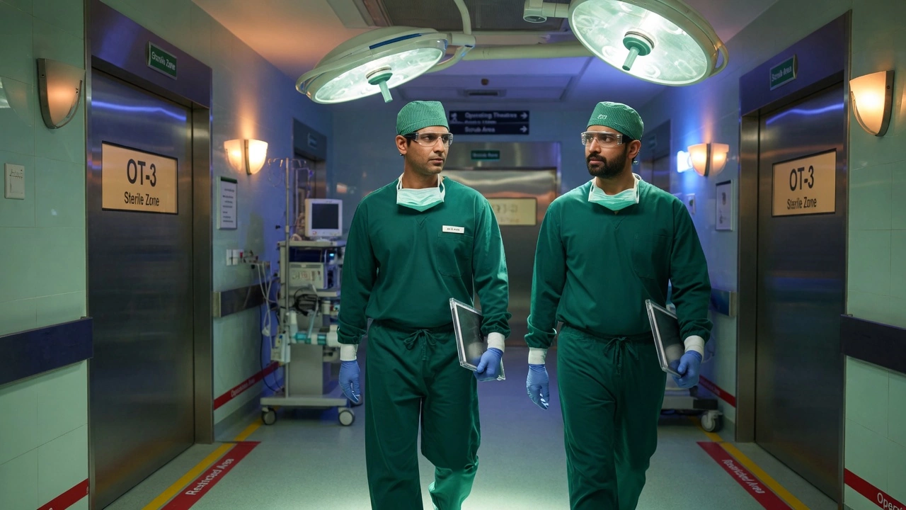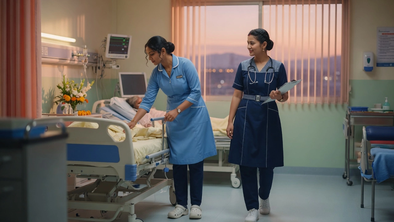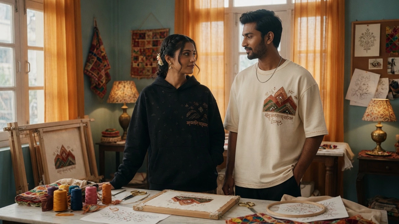
A name on a uniform does two jobs. It helps patients and colleagues address someone correctly, and it makes the garment feel like it belongs to the person wearing it.
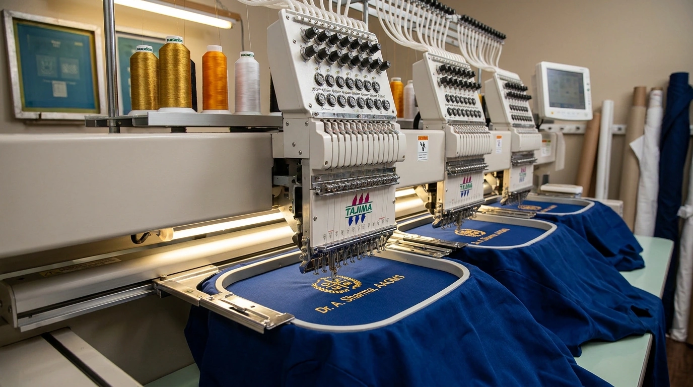
Names are harder to embroider than logos. Lettering is thin, the available space is small, and a spelling mistake cannot be hidden.

We set a minimum letter height so names stay readable after washing. We also choose a font that holds its shape at small sizes. A decorative font that looks elegant on a letterhead often turns into a blur on a chest.
Placement is standardised: opposite the logo, aligned to the same height. On lab coats, we sometimes move the name to the sleeve so it does not compete with a long hospital logo.
Before production, the client approves a typed name list, not handwriting. That single step removes most spelling errors. If a name is unusual, we ask for the spelling in writing and confirm it twice.